To mark the launch of the final two coins in the Falcon of the Plantagenets range, we caught up with Jody Clark, designer of the entire Queen’s Beasts Collection, which started with the Lion of England back in 2016.
How did The Queen’s Beasts Collection come about?
“The Queen’s Beasts Collection came about as any coin design would; it started with an RMAC (Royal Mint Advisory Committee) coin design competition. For the competition, we had to design two beasts in the series at first – the griffin and the lion. My design was shortlisted along with a few other artists’ work. Having been shortlisted, we had to model the designs ourselves and then, having reviewed them, they chose my designs.”
How did you begin to design The Queen’s Beasts Collection?
“I always start by just hitting the internet and reading books, taking a day for reading and gathering reference imagery and inspiration, and looking at what has been done before. Anything from just typing words linked to it into a search engine and seeing what comes up – anything to get my mind going basically. Then, I normally get it all out, have a look through it and then just start sketching. I like to create a little template of about 12 mini coins and just fill them up with loads of ideas. I like to limit myself and then get sketching. I think you can spend all day doing research – it’s never-ending – but something will come out of those 12 ideas that will make you think it might work well for your design.”
In that research, was there anything in particular that you were looking for?
“There are two approaches, the royal and the heraldic, or the fantastical approach. I wanted my designs to be somewhere in the middle of the two really; something that looked like a real beast rather than just a graphic heraldic image. For the falcon, I continued that balance of realism and a stylised look. I wanted the falcon to be powerful and majestic perched on top of the shield, so I looked at lots of images of birds taking off and landing to achieve the desired outcome.”
Was there any one thing that was the driving inspiration behind the bold designs?
“I wanted it to look strong. I think heraldry comes from battles, your arms in battle – to see who’s on your side, so I wanted it to look aggressive and strong. That’s the only clear direction I was trying to follow.”
Once you’ve got the idea that you want to proceed with at thumbnail size, where next?
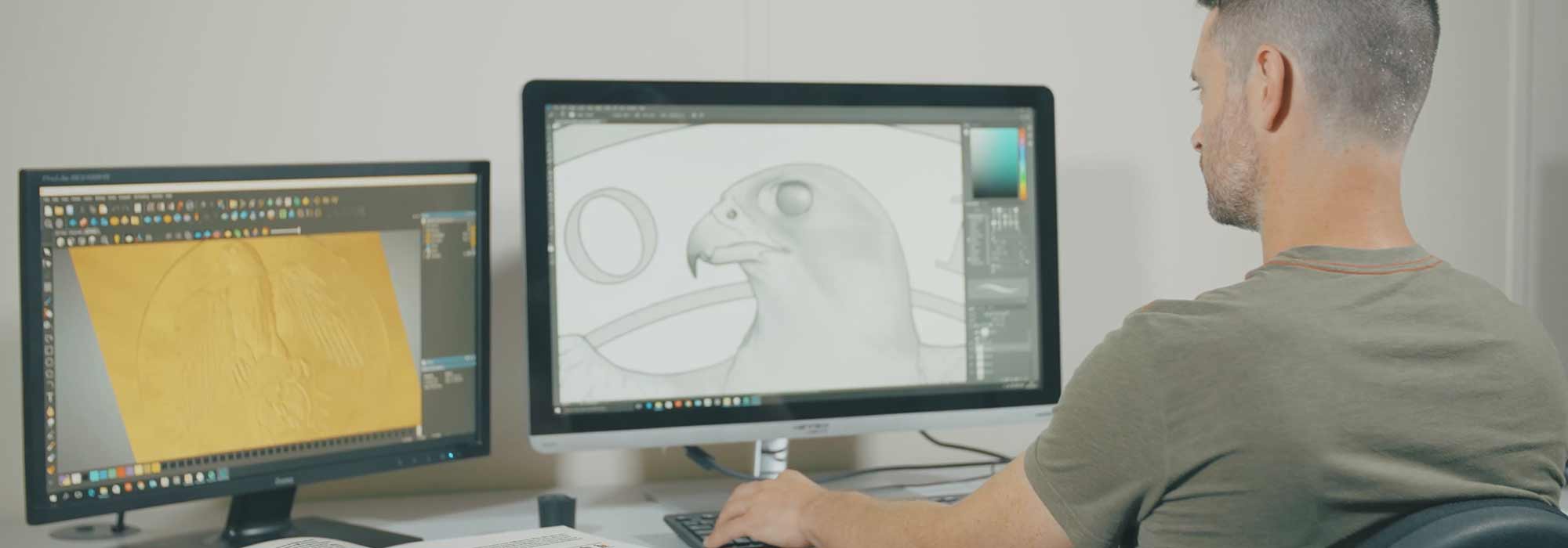
“Once I’ve decided on the direction from the tiny thumbnail sketch, I then start trying to figure it all out in my head. Once I’m happy with that then I scan it into the computer and use Photoshop® to draw my final image – it’s just like drawing with a pencil but you have more control and it’s a lot easier to ‘undo’ things, rather than rubbing out constantly. Once on the computer, I was also able to try the text around it – positioning the text is a lot easier on the computer. When I am happy with that I then submitted it to the competition. After being shortlisted, there were a few amendments that the RMAC suggested.”

