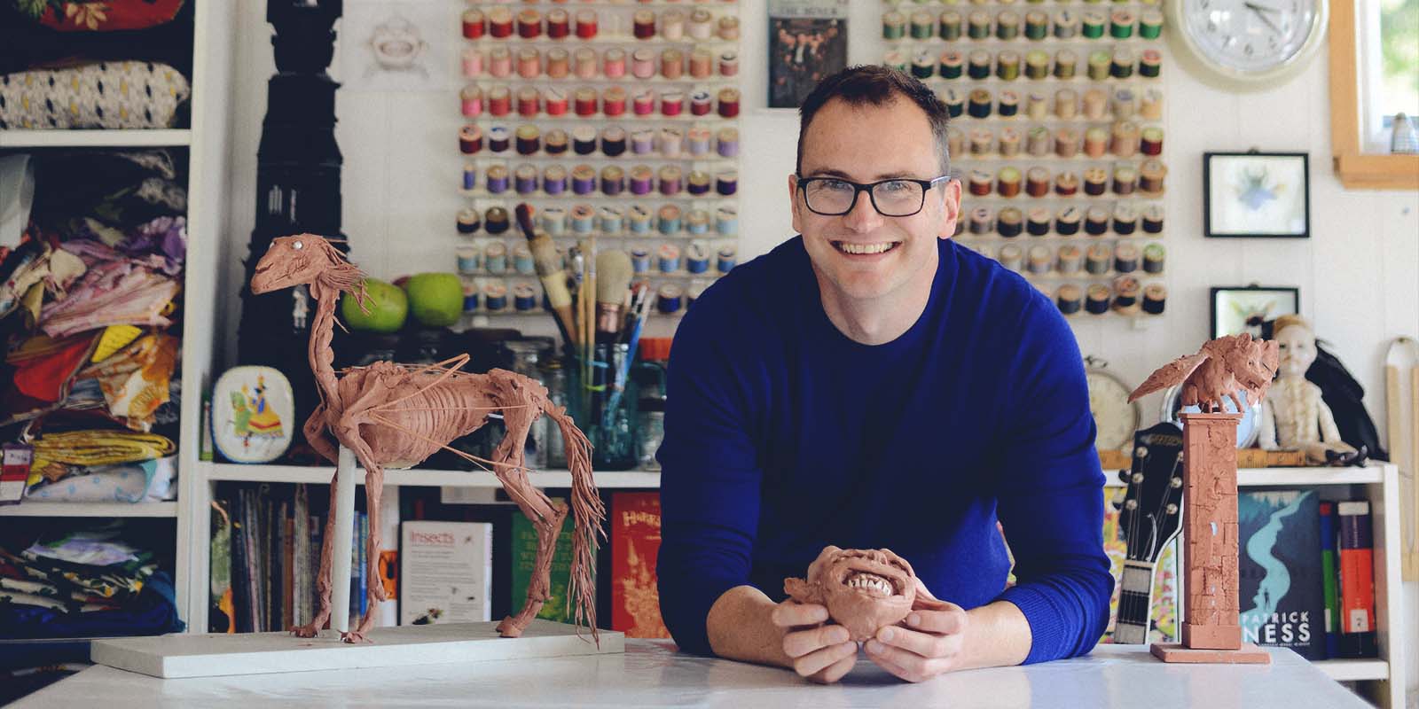
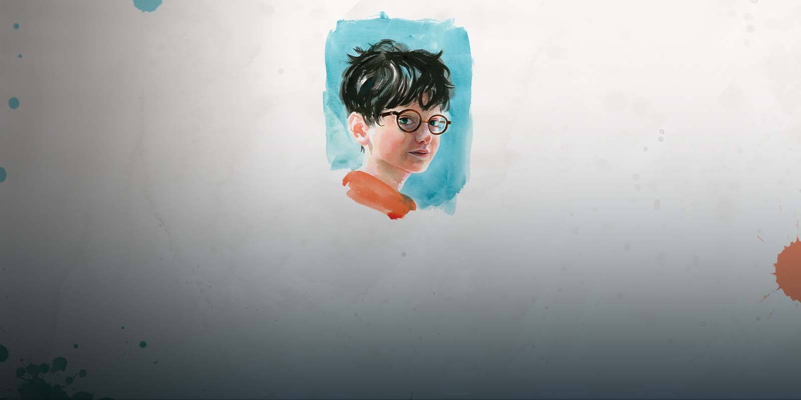
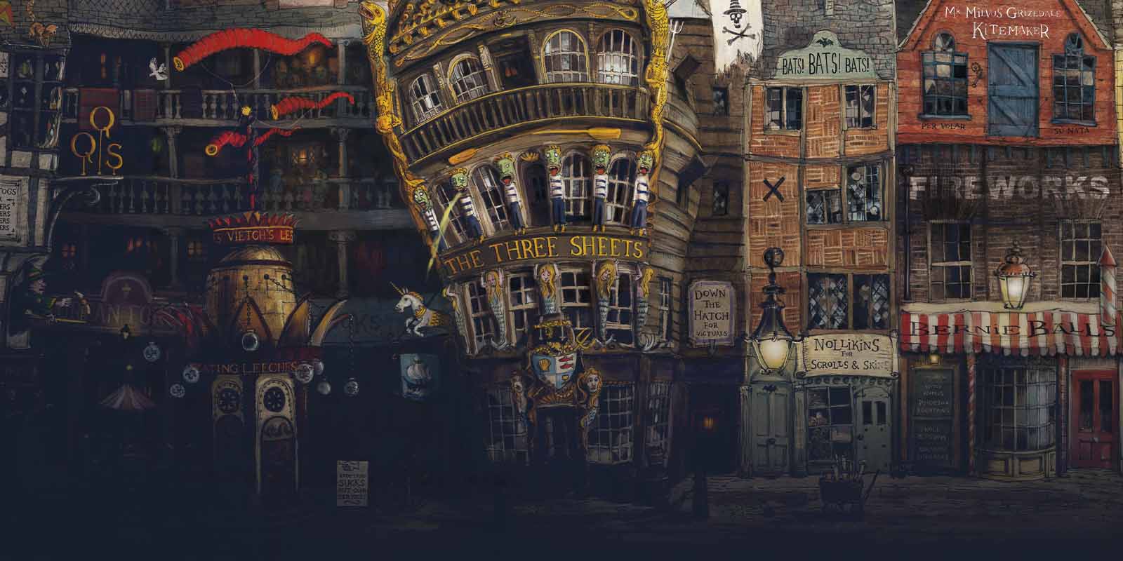
The stunning reverse designs for our Harry Potter collection are based on the work of Jim Kay, the artist who created the first fully illustrated edition of Harry Potter and the Philosopher’s Stone. We spoke to Jim Kay about his career, his work on this classic of children’s literature, and what being involved in the designs for this coin collection means to him.

Can you describe how you came to be an illustrator?
“I studied illustration at university but after leaving I really struggled to make ends meet. I was very naive I guess. I did all sorts of jobs to meet the rent, eventually lucky enough to work with the art collections at Tate Gallery, and the Royal Botanic Gardens, Kew. A friend persuaded me to start drawing again, and he managed to secure me a small exhibition space in London. From there I did a few freelance jobs, while working in a shop and a hospital to keep going. My first piece of extraordinary luck was being asked to illustrate a beautiful story by Patrick Ness, A Monster Calls. Within a year, I was able to work as an illustrator full time, starting on Potter in 2013. It was a very protracted process from leaving university in 1997, to finally becoming an illustrator, but I met some amazing people along the way.”
What inspired you to be an illustrator and what inspires your work today?
“For me it’s museums. Every object has a story, and I love trawling through London’s museum and gallery collections. It’s incredible to see a delicate piece of glass, hand-blown by a Roman craftsman, that has by some miracle survived centuries of war, strife and clumsy hands. Clothing in particular seems to give an immediate connection to lives past, and we are lucky to live in a society that values such ephemera.”
Talk us through your working methods.
“It’s a chaotic process. I usually start by reading the text at least three times, and each pass making tiny little notes, the size of a postage stamp. They are the most important sketches; indecipherable to anyone else’s eyes, but to me they are shorthand for that first reaction to the story. From there it’s a collaborative process with the publisher, selecting scenes, designing characters, trying to get the rhythm of the story right.”
How did you come to be chosen to illustrate the Harry Potter books?
“As far as I recall, I was lucky enough to be among a selection of illustrators presented to the author. That’s one of those phone calls where nothing in life is quite the same again. It’s been exceptionally hard work; I don’t find illustration easy or even particularly instinctive. It’s masses of depressing failures to fabricate something that kind of works, and it’s not a process that seems to repeat through any experience or well-trod methodology, but it can be a lovely feeling when something finally clicks.”
Were you a Harry Potter fan before you started working on the book illustrations? If so, what did you like about the books?
“I was a Potter fan, although I came to it late. It was seeing everyone reading Potter on the London Underground while travelling to work I thought ‘I should give that a go’. Personally, I enjoyed how Harry Potter and the Philosopher’s Stone dredged up my own dusty memories of school life; you forget how hard it was! Exams, rivalries, family feuds, moments of innocent exuberance. I’m also a big fan of world-building, and Jo has created a wonderful rich environment populated by some cracking characters.”
How did you approach the commission for the illustrated edition of Harry Potter and the Philosopher’s Stone?
“With enormous trepidation. I was so anxious about tackling such a successful franchise that I kind of started on the really insignificant parts of architecture – doorknobs, windows, chimney pots – and gradually created the stage on which the players would perform. So Hogwarts was the first thing I tackled, which is actually one of the main characters in the book. The castle has its own little foibles and personality, it definitely comes across as a sentient structure in the books – just look at the Room of Requirement. After that I had to go over all of the books and begin casting the characters, often basing them on people I knew. I think Hagrid was one of the earliest, and most fun. I love giants, they make adults feel like children again. Dumbledore was tricky, he needs to be both warm and approachable, with a knowing twinkle, but with the capacity to be powerful and terrifying too. I like that he is respected as one of the greatest wizards – imagine those abilities – but he also enjoys knitting.
“I did a lot of research in museums and libraries too, many hours looking at architecture, clothing, old herbals and the writings of alchemists.”
How did making a model of Hogwarts Express help you create the illustration of the train and platform?
“The drawback of working on fantasy is that many of the places and creatures don’t exist, so making models really helps. It gives you something solid to draw from, to light how you want, see how the shadows fall, and arrange alongside other models. I had a lot of platform to fit on the cover, and yet allow for text on the front, spine, back and flaps. I made a model train and little model people, even a paper owl, just to quickly arrange a comfortable composition without constantly redrawing.”
The illustration of the busy platform nine and three-quarters is dynamic but has a very still Harry at its centre; how did you go about creating this effect?
“Well, if I’m honest the majority of the passengers and platform looks ‘loose’ and ‘expressive’ because I simply ran out of time. Time is a constant pressure in publishing. You never really ‘finish’ an illustration, you just run out of time. The whole painting was done with tester pots of decorator’s paint. Awful to paint with but cheap and you can buy some lovely subtle tones and colours – saves on mixing!”
Your illustration of the train is now going to appear at a small scale as a coin but how big is the original artwork and how long did it take to create?
“Cover art is really tricky because it has to be a very wide illustration in order to wrap the entire book, including the flaps. I worked on mount board, as big as I could find, so it’s probably at least a metre wide. It took just over a week I think, I seem to remember being up against quite a tight deadline at the time.”
How does it make you feel to know that your work on Harry Potter and the Philosopher’s Stone is going to appear on a coin?
“It hasn’t really sunk in yet. It’s the same for most aspects of publishing – because you are on your own all of the time in a studio, none of it quite seems real until you see the book on a shelf in a shop. Then you think ‘oh yeah! I did that!’ This is completely new to me though, a coin!”
Be Inspired
SPELLBINDING DESIGNS IN PRECIOUS METALS
FIND OUT MORE
GALLEONS, SICKLES AND KNUTS: POUNDS, SHILLINGS AND PENCE
FIND OUT MORE


