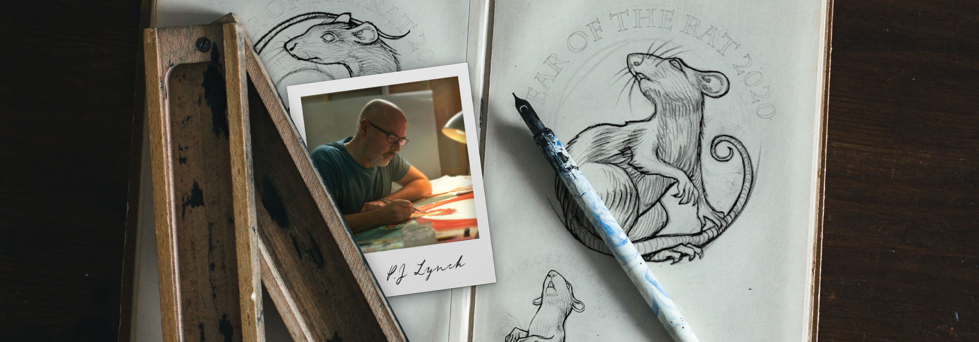
In 2020, the Chinese zodiac starts over with a new cycle. By virtue of being the first lunar animal, the rat is in the ascendancy. People born in the Year of the Rat are considered intelligent, curious and optimistic. Naturally adaptable, they’re great at fitting in.
The rat is the seventh design in The Shēngxiào Collection and this year’s coin has been designed by acclaimed illustrator P. J. Lynch.
We spoke with him to find out more about his interpretation of the rat, the challenges he faced and what he drew on for inspiration:
As a book illustrator, how different has this project been from your usual design work?
“Working as an illustrator requires a degree of versatility. Over the years I’ve worked on many different projects involving an assortment of shapes and sizes. This was different though – designing a coin presents challenges I haven’t had to deal with before. The trickiest thing for me was creating my design without using shading or colour. This made me concentrate much more on the linear depiction of the rat and I had to dig deep creatively to achieve an interesting, twisting pose.”
What was your inspiration for this coin?
“The Chinese lunar calendar celebrates the traits of the animals which characterise each year. I wanted to portray these positive traits but still remain true to the animal’s essential ‘rattiness’.
“When I have drawn rats before they have mostly been unsympathetic characters but here I wanted to show one that is admirable and likeable.”
How did you go about designing this coin? What did you do to research?
“The first thing I did was to do a bit of research into the Chinese lunar calendar. Then I assembled hundreds of images of rats from books and websites. From this stockpile I started to draw and my first design ideas emerged. Only then did I let myself look at other coins that had been designed to celebrate the zodiac animals.”
Talk us through the different elements of the coin.
“Obviously the most important element is the rat itself, which had to be appealing and interesting. I showed my rat as it twists, responding to a noise or something happening nearby. The rat is momentarily vulnerable, but also curious and unafraid.
“As well as the twisting body I was able to have fun with the rat’s long curvy tail, which weaves its way around the composition through the flowers. I chose peonies because of their popularity in China and association with good luck”.
“The arch of text frames the upper hemisphere of the design, and then the only other element is the Chinese character for ‘rat’. I have placed this so that the trailing stroke echoes the shape of the rat’s face and jaw. I wanted them to look like continental plates on a globe that might belong together.”
What were your biggest challenges when approaching the design?
“Rats are usually depicted unfavourably – cast as villains or rascals – so the biggest challenge was making the rat appear as a positive kind of a character. And I must say that after weeks and weeks of drawing cuddly, intelligent and heroic rats, I have been completely won over. I am now an enthusiastic rat fan.”
Discover great stories from history and how we're celebrating these moments within The Royal Mint
Read more

