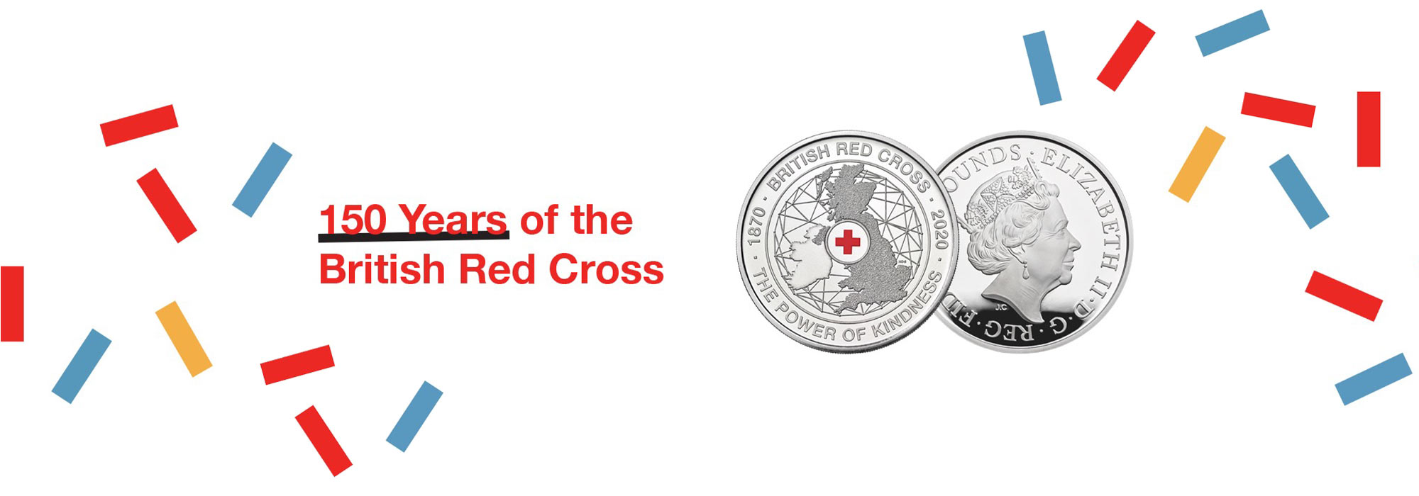
Encapsulating the heart and spirit of a historic organisation on the face of a single coin is no small feat. Fortunately, designer Henry Gray was more than up for the challenge and managed to succinctly capture the history and heritage of the British Red Cross whilst still reinforcing its relevance today.
Speaking on the coin design process, Henry Gray had this to say, detailing the overall design journey along with the various trials and tribulations he experienced along the way.

Designing the British Red Cross Coin
“Every brief from The Royal Mint is always interesting, covering a variety of diverse subjects. I knew this first-hand from working on 2017’s First World War Aviation £2 coin and the brief for the 150th anniversary of the British Red Cross was no exception.
“My designs are rooted in finding a narrative that can communicate a message that resonates. Before beginning my design process, I always conduct in-depth research and aim to let the stories that I uncover guide the direction of the design.
“The whole process involves three primary stages of design, covering the initial concept all the way through to the final design. For this release in particular, several designs were made at each stage before eventually being whittled down to the finished article we see today.
Representing the British Red Cross
“The main challenge I found during this particular project was trying to marry the mainly historical public perception of the British Red Cross with its current brand positioning today. The space available to create a compelling narrative is very restrictive, so a distillation of a key theme or idea is often the only solution.
“It was important to honour the military roots and historical reputation of overseas aid as they continue to play a big part to this day. Meanwhile, it was equally important to cover the five modern roles of the British Red Cross: crisis response, first aid, independent living, refugee and asylum seeker support, and international work.
“With the richness of the British Red Cross's history and changing roles for the future, this coin needed to say many things to many people without being overtly descriptive of any single event or direction. This began with the emblem.
The Iconic Red Cross Emblem
“The Red Cross emblem was designed to be understood instantly in the fog of war, to save and protect lives. The emblem itself encompasses the history of the charity and is arguably more recognisable than the organisation’s name.
“As a result, I wanted to make sure the emblem took pride of place as a focal point of the design. I positioned the iconic red cross in the prime central location to highlight this, opting to place the words around the edge of the design.
“I also felt it was equally important to include the UK in the design to reinforce the national element of the charity. As the British Red Cross is a proudly British organisation, I included the UK map in prominent position behind the emblem.
The Power of Kindness
“Building on this, I included a distinct background texture to represent the multiple touchpoints of the charity and reinforce the connectedness of the British Red Cross both at home and around the world. The image hopefully illustrates that the British Red Cross is and has always been connected – locally and globally – with networks of support and the ability to respond to those in need with kindness.
“The inclusion of the current British Red Cross slogan – 'The Power of Kindness' – acts to reinforce this key message, highlighting the human element of the charity. My hope is that the coin design helps to raise the profile of the British Red Cross and aid them in the amazing work they carry out on a daily basis.”
Discover great stories from history and how we're celebrating these moments within The Royal Mint
Read more

